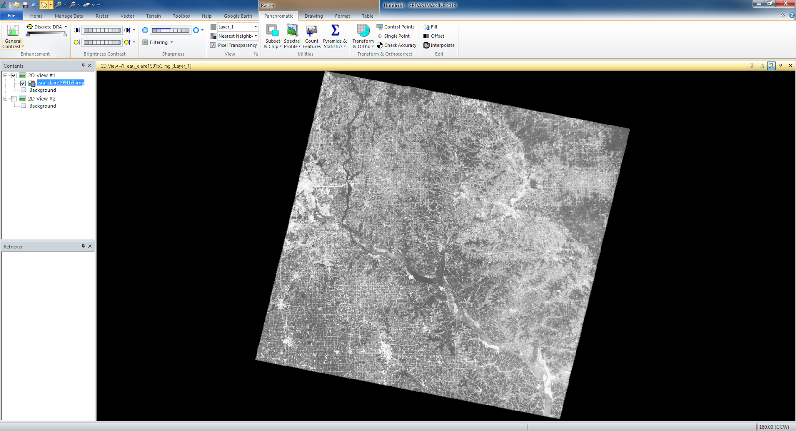
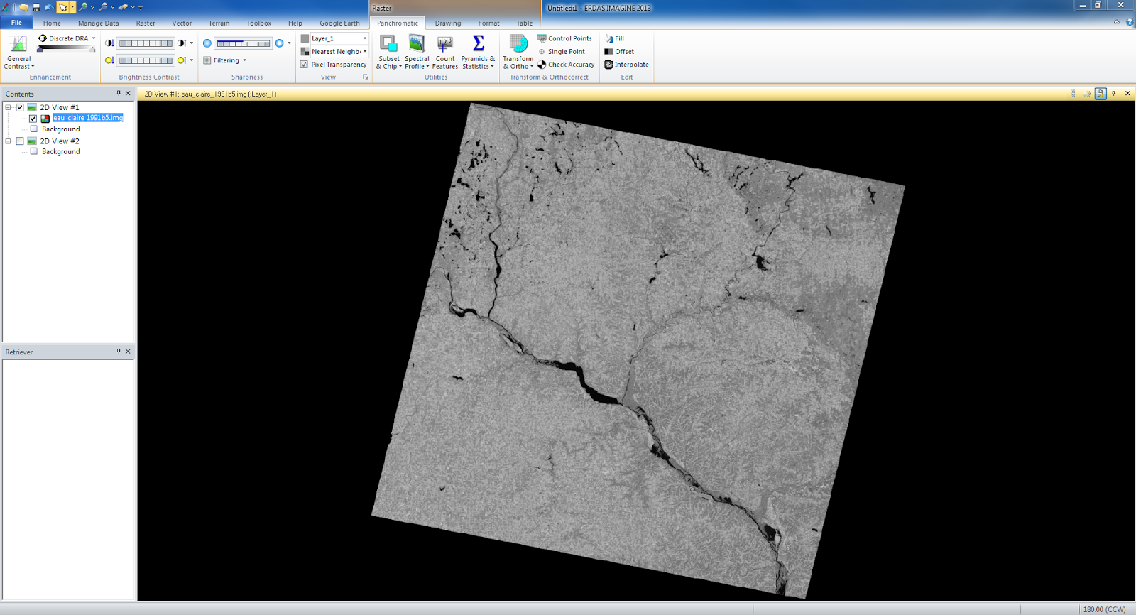
Methods and Results - The first part of the lab was about scale, measurements, and relief displacement. We took a photo of Eau Claire, WI and found the scale of the image by measuring a feature with a ruler and then extrapolating the scale against the actual size of the feature. We also found how to determine the scale with just the altitude of the aerial photograph and the focal lens length. The equation is: Scale equals focal lens length divided by the altitude of the aircraft minus the ground elevation. Next we measured the perimeter and the area of a local lagoon by digitizing the lagoon into a polygon. The last section of the first part was dealing with relief displacement. The object that is displaced is a smokestack in Eau Claire. The smokestack appears to be leaning because it is not close enough to the principal point which is the point underneath the aircraft when the picture was taken. The equation for that is as follows: Relief Displacement equals height of object in real life multiplied by the radial distance in the image divided by the height of aerial camera above datum. The radial distance is the distance between the principal point and the object. Now, once the relief displacement is calculated you can adjust the object to lean towards or away from the principal point.
The second part of the lab was learning to make a stereoscopic image in Erdas Imagine. I took a image of Eau Claire and a digital elevation model (DEM) file of Eau Claire and using the Anaglyph Generation tool I created a new file. The new file when looked at with polaroid glasses, conveys a 3D image of the area.
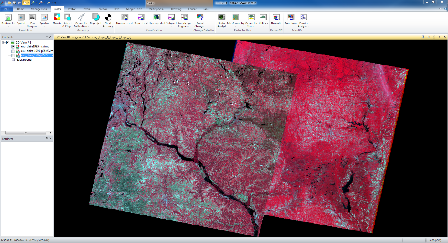
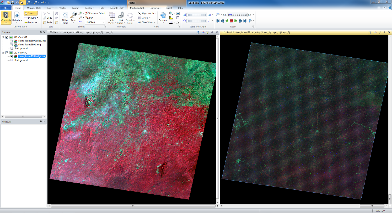
In the third and final part of the lab, we learned Orthorectification using Erdas Imagine Lecia Photogrammetric Suite (LPS). We had two images of an area that overlap each other, however they currently do not match up. To match them up we first took the first image and created twelve GCPs to connect the image to a datum and a projected coordinate system. Next I used a elevation DEM to add the elevation of each point in the data. I then did the same process with the second image matching it up with the first and therefore both had the correct coordinate data. In figure 1 it shows the first twelve points that I connect to both images.
 |
| fig 1 |
Next we used the automatic tie point generator to connect the images and then the Triangulation tool. The output LPS screen is show below in figure 2.
 |
| fig 2 |
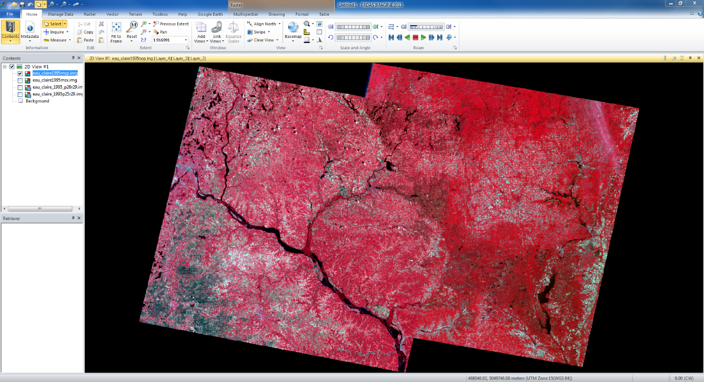
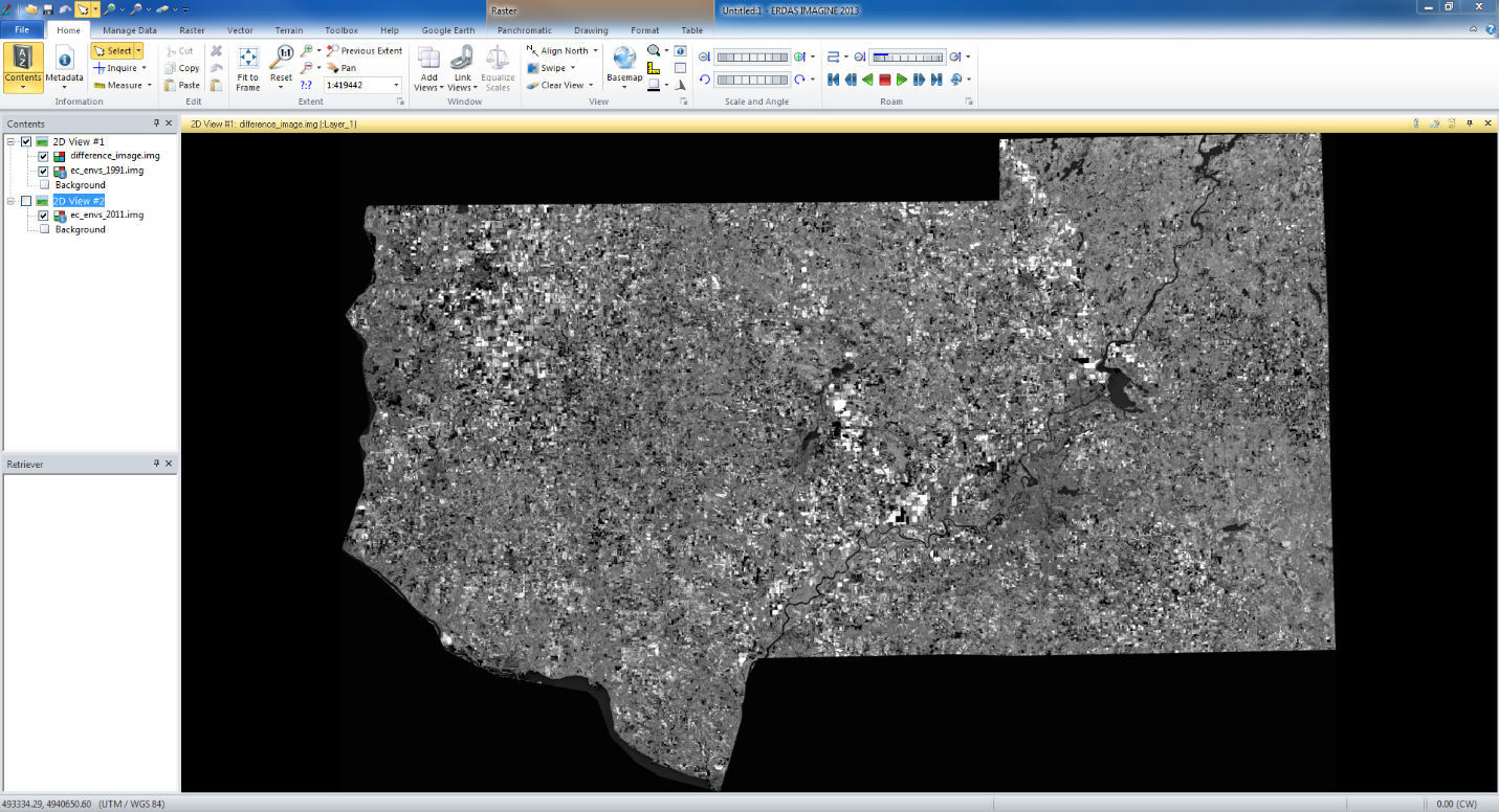
Lastly I brought the images in the viewer in Erdas to see if the images boundaries were fixed and accurate. The image below (fig 3) shows the two images with their new projections.
 |
| fig 3 |
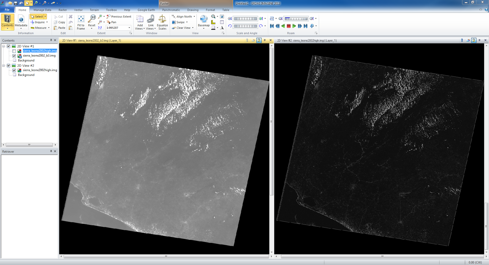
The
degree of accuracy at the boundaries of the images is very high. From zoomed
out you can see a line between the images, but when zoomed in you can barely
even tell the where the two images border at certain areas. The boundary twists
and turns on the west border over the mountains and creates a twisting and
super accurate boundary.
Sources - All satellite images provided by Cyril Wilson.